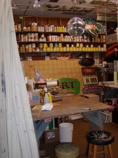
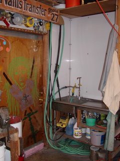
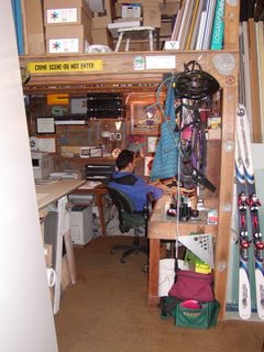
This was the Studio Friday topic this week---and the studio I covet is my husband's sign shop. It is a separate building from our house, right out the back door---just 10 steps & he's inside, nice commute! What I like about his place is the tremendous space available. Terrific high ceilings, large industrial sink, cozy computer area & tons of storage. If it were my space it would look way different tho---but that's just because we work in such different mediums. He uses his shop for silk screening, wood working (those sign boards just don't cut themselves), gold leafing, metal work, along with painting etc.
He has at times let me work out there, and welcomes company, but it's not my studio, so though I have taken him up on his offer, I usually just work a while, finish up then go back inside the house to my space---there's something to say about an area being yours---it's comfortable because it's set up how you want it to be. Your supplies are in their expected spots, and you don't feel like you're imposing on anyone else.
Because I now have my own pastel studio I feel less need for more space than I did a year ago---but there's always that thought in the back of my mind---"what if...."

This shows the view to the right as soon as you walk in the door of his shop.

Nice loft storage, high ceilings...

The mirror ball is left over from the parties my daughter had in the shop this past fall.

The fabric screen on the right is pulled over to protect the rest of the shop while he was cutting out sign boards this week---it's usually pushed back against the far wall, opening up the space further.

This shows the industrial sink area---and the door my daughter was painting this summer...

Lastly, a peek back under the loft area where my husband is busily working away on his computer.
1 comment:
OOOOOOOOOOOOOOO I could jam in there. Very rustic and perfect to create in! I can see me tryin' my hand at painting in there for sure. And ya know? I want to make a mimiBOOK when I look at your place!!!!
Thanks for sharing -Karla
Post a Comment